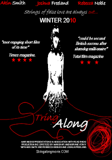
Film poster number one, is the way it is because I wanted to focus on the strings. With all my posters the men are no, seen this is to keep the mystery going of what she is holding and what it relates to, not to give too much away. As simply seeing her with two men in the background would basically give away the whole story.
The colour scheme is red black and white as they are the key colors in the film, red being the main one as this film is about the red strings of fat, the black acts as a background colour, which brings out the red a lot, and also represents the abstract world which occasionally comes up in the film. The white acts as a complimentary colour, not to make the film m look like a typical horror film, as clearly that is not what it is. The ball of string is also present in the poster to enhance the concept of the strings of fate.

This second, is done this way, once again to emphasize the whole idea of mystery, the red and the men, which is why in this one of her lovers is shown but only half way to keep the mystery going on. I chose this picture as it was a key part in out film, he whispering kind of controlling and telling the men things which make her fall for her not even knowing about each other. Once again the titles and fonts remained the same, and they do in all of my, posters because they go with the theme of stings.
string along also has aspects of romance and intimacy which is why I chose this picture as it is, intimate but not too much and gets a message a cross which may not be the clearest but would push audiences to watch the film.

Finally his poster is one of my favorite. I did it this way to switch it up, as I wanted to emphasis on the red however not make it too similar to the first one as I had the same intention in that one. Here we get a feel of the whole film but not too much. This is done through the small pictures in one end of the film this idea was taken from film posters with many different blocks with different scenes or different characters, I though this was an effective way to show the feel of a film kind of like a mood board and a poster all in one. The bigger picture on the right, of the main character Delilah, is one where she is the focus I did this because at the end of the day the whole film is basically about her life. Her lipstick is highlighted from the black and white feel of the picture, and once again, this was done to highlight the red, and the theme of the strings of fate. This is also done through the title font.

They are all very good posters and I can clearly see the house style, which have similar colours, Red, Black and White.
ReplyDeleteI also really like the way how on each posters title the ‘S’ is made by a red string, it relates very well to your film and therefore gives the audience a gist of what the film has got in it.
Something that you may want to improve on is the way you use the colours because although the posters look very good and professional, they look as if the film is a horror movie.
Other than that I think the posters are very well made and do relate to the film and tell the story, since in all three posters the girl is in the centre of attention and therefore we know that she is the main character and she does look mysterious and dark.
The first image has good counter colour balance, the colours red and black go well with the poster. Also I like how there is more black in the poster such as the background because it makes it clear that that the film may have drama.
ReplyDeleteAlso the title of the film is done creatively with the strings and agian it shows the theme of the story. However you could of added more colour for the girl in the poster
The second image is not really clear, because the majority of the characters are in red. Maybe there could be more focus on the colours used.
Also the word 'string' in the title needs to be shown more because it does not stand out but blends in slightly.
I like the layout in the third picture, I also like how the red lips in the main character is highlighted. Also it would be better for more colour to be added in the smaller images on the left
All your posters are REALLY GOOD!!! I love the way you have edited them GREAT JOB, the first two in particular look very intense and I dont feel the intensity match your film but having said this looking at your third poster I think it works perfectly . Not too much intensity and a great use of black and white to contrast the red lipstick. Great Job.
ReplyDeleteI absolutely love your posters! They illustrate the film well as well as emphasise the use of the colour red throughout your motion picture. I prefer the first and last poster in comparison to the second just because i think the second one is a bit too red. However, i still really like it. I especially love the way you have edited the title "String Along" to actually look like string as this gives more depth to the meaning of the film. Very good job :)
ReplyDelete